


Supporting CTA text
Hero component (heading, H1)
Rating description

Article component (H2)
This section demonstrates a generic article content block used to display structured informational text on a page.
It can be used for explanations, introductions, or any long-form content where readability and layout are important.
The content is intentionally neutral and serves as an example of how paragraphs, spacing, and typography appear on the frontend.
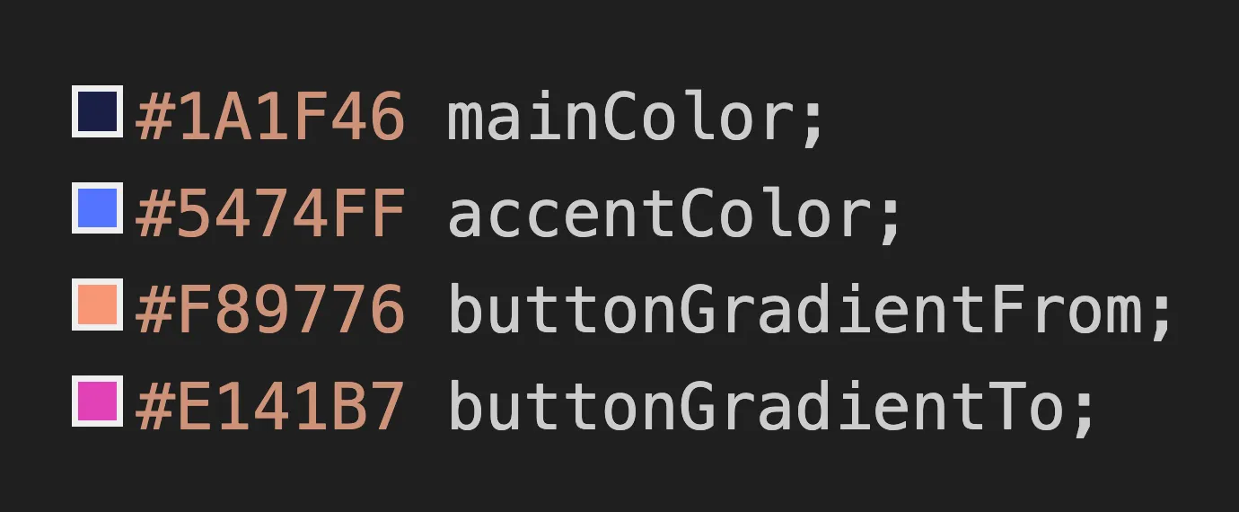
Color Variables
A screenshot displayed next to this section illustrates the color palette used on the page.
Heading 3
Below is an example of a bullet list, commonly used to highlight key points or features within an article:
- Primary item — short description of a key concept.
- Secondary item — supporting explanation or detail.
- Optional item — additional information for context.
- Extra item — can be used when more points are needed.

Quick Comparison
This table demonstrates how comparison data can be displayed inside an article section.
| Item Type | Description example | Use Case |
|---|---|---|
| Primary option | Main configuration | Most users |
| Secondary option | Alternative configuration | Advanced users |
| Extra option | Optional add-on | Specific cases |
How This Section Works
- Add structured content using headings and paragraphs.
- Use lists to highlight important points.
- Insert tables for comparisons or structured data.
- Combine text with other elements such as quotes or code blocks.
Expert Insight
Well-structured content improves readability and helps users quickly understand the information presented on a page.
- First Section — a short introductory point that demonstrates how primary information can be organized for quick scanning.
- Second Section — supporting information that expands on the main topic and provides additional context for the reader.
- Third Section — a structured subsection that shows how nested content can be used to organize more detailed points.
- First Unit — a smaller piece of information related to the main section.
- Second Unit — another supporting point that demonstrates hierarchical structure.
inline code
function hello() {
  console.log("Hello, world!");
}

Section component 1
Supporting text displayed under the heading to illustrate how a typical section of content might appear on a page. This paragraph demonstrates spacing, typography, and how text flows within the layout. In a real website, this area would usually introduce the topic of the section and guide the reader toward the key points presented below.
FAQ component
What is this section used for?
This is a placeholder answer used to demonstrate how frequently asked questions are displayed on the page. It can be replaced with real content later.
How does this feature work?
This answer provides sample explanatory text to show layout, spacing, and text behavior inside the FAQ block.
Can this content be customized?
Yes, this text is fully customizable and serves only as an example of how editable content may appear.
Is this information final?
No, the content here is intentionally neutral and temporary, designed for demonstration and testing purposes.
Where will this section appear on the page?
This FAQ block is typically placed below main content sections to provide additional context or clarification.
Can items be added or removed?
This section supports multiple entries and can be easily adjusted to match specific project needs.
What happens if this section is empty?
Underline
What happens if this section is empty?
If no items are added, the section can be hidden or replaced, depending on the page configuration.

Section component 2
This is a placeholder text used to demonstrate how descriptive content appears within a section.
It helps visualize spacing, typography, and overall layout before real content is added.
Swiper component (small)

Product title

Product title

Product title

Product title

Product title

Product title
Swiper component (big)

Product title

Product title

Product title
Labels component 1


Label title
Short description
Label title
Short description
Label title
Short description
Label title
Short description
Label title
Short description

Label title
Short description of lable with a few more words

Label title
Short description of lable with a few more words

Label title
Short description of lable with a few more words
Label title
Short description of lable with a few more words
Demo component


| Attribute | Lorem Ipsum |
| Value | Dolor sit |
| Category | Consectetur |
| Detail | Adipiscing elit |
| Amount | 00,000.00 |
| Quantity | 00 |
| Minimum value | 0.0 |
| Maximum value | 00 |
OfferList component

Offer name
- Responsive layout for different screen sizes
- Configurable settings and flexible options
- Support for multiple content types and use cases
Bonus text description
Offer name
- Responsive layout for different screen sizes
- Configurable settings and flexible options
- Support for multiple content types and use cases
Bonus text description
Gallery component

Photo Heading

Photo Heading

Photo Heading

Photo Heading
Preview component

Section heading (H3)
Supporting placeholder text used to demonstrate layout and typography.

Section heading (H3)
Supporting placeholder text used to demonstrate layout and typography.

Section heading (H3)
Supporting placeholder text used to demonstrate layout and typography.

Section heading (H3)
Supporting placeholder text used to demonstrate layout and typography.
Author component
Content Specialist
This is a placeholder author description used to demonstrate how author information appears on the page. It helps visualize layout, typography, and spacing before real author details are added.
The text is intentionally neutral and can be replaced with actual biography or expertise information later.

Reviews component

This text is a placeholder used to demonstrate how short review descriptions appear on the page. It helps visualize spacing and text flow within the reviews block.
This text is a placeholder used to demonstrate how short review descriptions appear on the page. It helps visualize spacing and text flow within the reviews block.
This text is a placeholder used to demonstrate how short review descriptions appear on the page. It helps visualize spacing and text flow within the reviews block.
This text is a placeholder used to demonstrate how short review descriptions appear on the page. It helps visualize spacing and text flow within the reviews block.

Title of Popup Section
Description: this pop-up demonstrates how modal content appears on top of the page. Use it to display important messages, confirmations, or additional information.
Promo title
This is an example of a promo component used to draw attention to important information. Replace this text with a short message that highlights your product, service, or announcement.
Disclaimer text: the information shown here is for illustrative purposes only and is intended to demonstrate how this component may appear on a live page.